Meet: Artist in residence Janavi Kramer
Ocean Artist, Scientific Illustrator, and Storyteller, Janavi Kramer joins us as our next Artist in Residence on 6-8 June.
Read moreA familiar face in the Watergate Bay design studio, G.F Smith paper consultant and independent artist Mark Jessett knows all about the alchemy of pigment and paper. He tells us how G.F Smith found the world’s favourite colour, and how peddling paper and playing with colour has taught him to look for the unexpected.
Vermillion, cinnabar, malachite, indigo, chartreuse, ochre, scarlet. Say the words slowly and they sound like a spell. Rich in associations, colours call up memories and conjure impressions beyond pigment, paper or pixel. Only fleetingly attached to objects, colours happen where and when the light meets your eyes, shifting with context and the time of day.
“I love finding unexpected colour. I’ll look at a shadow and suddenly see pink in there, it’s magical.” Mark Jessett has often seen colour’s magic first hand. “Years and years ago I bought a copy of Josef Albers’ Interaction of Colour,” he confesses. “It’s sitting in my studio, but I’ve never read it – because I don’t want to know! I prefer to experiment.”
Colour flings out something immediate. Start with a piece of deep blue paper and you’re already halfway to something.

By day, Mark is a consultant for international paper merchant G.F Smith, travelling across the South West (pre lockdown, of course) with a bag of beautiful swatches, talking grammage and grain direction with designers and makers.
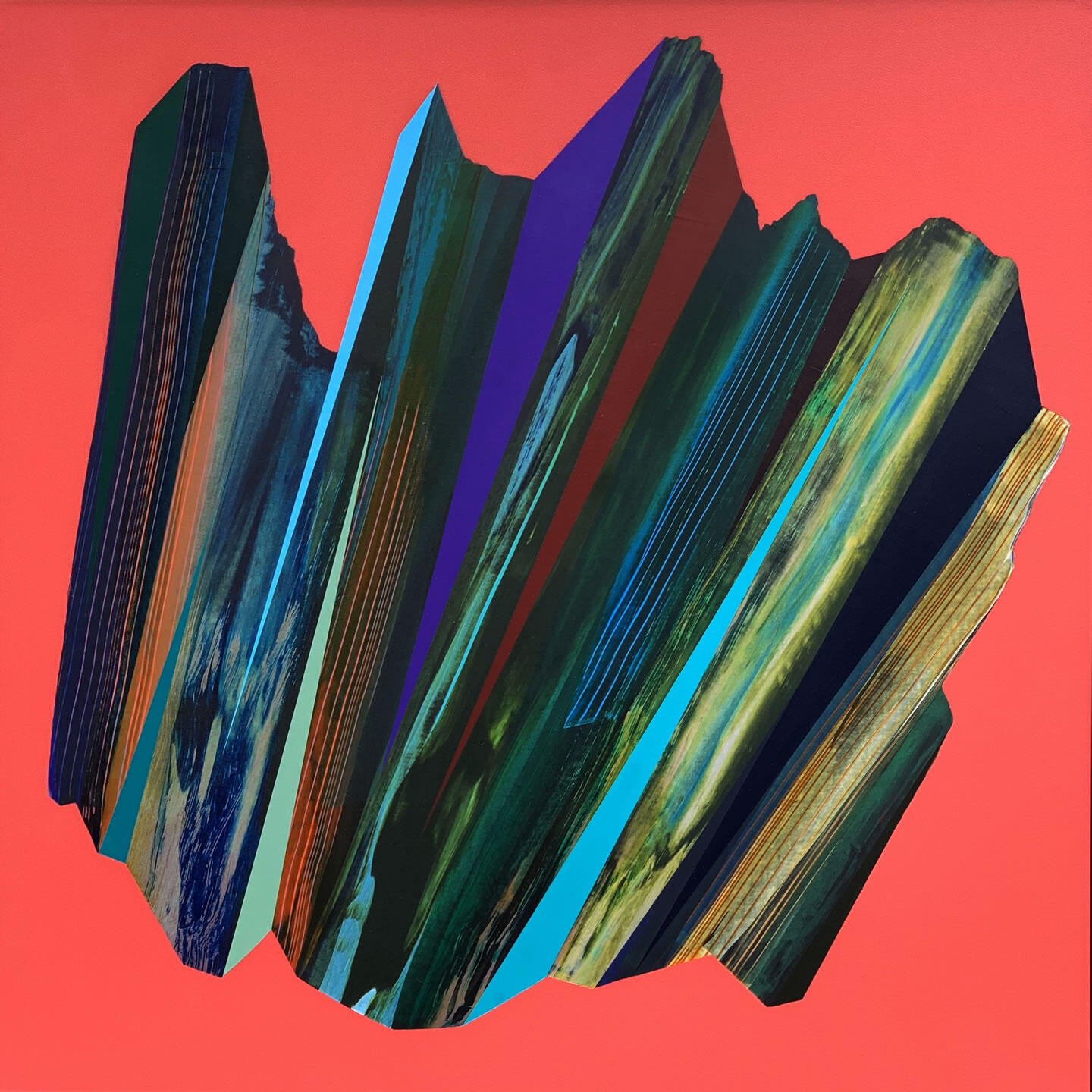
Working with Watergate Bay for many years, Mark has often helped turn onscreen ideas into beautiful tactile objects. In his spare time, Mark is a respected artist himself, creating vivid abstract pieces on finely embossed Japanese paper.
“When I apply paint to this paper with an edge instead of a brush, it makes an incredible effect,” he says, describing his technique. “When I lay another colour over that, it gets really interesting. I work with colour on top of colour, finding new and unusual combinations.”
Mark’s artworks are inspired by what he has learnt about paper’s potential. “I’ve been in paper for 20 years now,” he says. “It feeds my creativity, talking to people who are making things.” He’s a dab hand at persuading students and clients to consider paper as a medium in its own right. “With digital design, there’s a white screen, and you inflict colour onto it. But if you start thinking with paper at the very beginning, you get a whole set of surprises.” And, he says, nothing is more prone to surprises than coloured paper. “Colour flings out something immediate. Start with a piece of deep blue paper and you’re already halfway to something. Put red onto green paper and it becomes something totally new.”
G.F Smith sold its first coloured paper in 1885. Its Colorplan range, which launched in 1972, includes shades first released in 1936 – ‘Bagdad Brown’ and ‘China White’ – and has since grown to over 50 shades.
Each era’s additions represent changing times and changing tastes – take the ‘Mandarin Orange’ of the swinging Sixties and the earthy ‘Stone’ of the Seventies.
In 2017, G.F Smith sought a new shade to add to the spectrum. With customers on every continent, it decided to embark on a global hunt to find the world’s favourite colour. This hunt became the largest colour study to date, and a repository for people’s colour stories.
The most commonly named favourite colours were greens and blues, and the winner was ‘Marrs Green’ – a luminous teal, sitting somewhere between the two.
Limited edition products featuring Marrs Green by Anglepoise (lighting), Sunspel (t-shirt), Richard Brendon (cup and saucer), Hayche (WW Chair), tokyobike and Cambridge Satchel Company.
25,596 people from all over the world picked their favourite colour, and told G.F Smith why. Anyone interested in the project could head to a dedicated web page, where the screen would change hue as their cursor moved. When they landed on the colour they liked the best, they’d enter their name.
“You could also put in a bit of text about what the colour meant to you,”
Mark explains, “and that’s where it got really interesting.”
Analysing this bank of data, G.F Smith could pick out patterns, revealing ways we see the world. “The linguistic associations we make with colour are fascinating,” Mark says. “The study threw up all these positive connections we have.” Words like ‘happy’ and ‘smile’ accompany favourite yellows; ‘ocean’ and ‘sea’ the deep blues; ‘earth’ is mentioned next to dark greens and warm rusty shades. The most commonly named favourite colours were greens and blues, and the winner was ‘Marrs Green’ – a luminous teal, sitting somewhere between the two

Why Marrs Green? There are multiple theories as to why we prefer some colours to others. ‘Ecological valence theory’ proposes it’s to do with the objects we like best, explaining our attraction to blues – the colours of sky and sea, and aversion to bodily function browns. Another theory credits the biological wiring of our brains, suggesting evolutionary reasons for preferring one colour over another.
Another, that it’s the attributes we associate with colours – brightness and darkness, cleanliness and dirtiness. Colour associations might arise from culture, the origins of the connection lost in the history of symbols changing hands. Certain cultures mourn in black, others mourn in white – shifting the way those colours are perceived from place to place.
Language affects our favourites too. One study found that people prefer the colours they’re easily able to name. Language might even affect the colours we’re able see and distinguish. In the Russian language, the colours we collectively call ‘blue’ are two conceptually distinct colours, a light blue and a dark blue – and research has shown that Russian speakers can identify differences between blues that non-Russian speakers are unable to see.
A colour shines in its surroundings, just as eyes only smile in a face.
When it comes to the winning blue-green shade, studies have shown that blue and green are commonly associated with calmness and relaxation. There’s also plenty of evidence that we’re attracted to nature’s hues, which won’t surprise anyone who knows Cornwall and its blue horizons, turquoise coves and deep green hedgerows.
Announced with Marrs Green paper confetti, falling from the sky, and the release of a slew of Marrs Green products, the deep teal entered G.F Smith range – where it’s remained a popular choice ever since.
'Ceremonial (Kay)’ by Mark Jessett
Since the survey, G.F Smith has mined its data to add more colours from the world’s favourites to its collection – namely Hot Pink, Chartreuse and Rust – showing that worthy candidates for the top spot came from every corner of the spectrum. If anything, the search for the world’s favourite colour taught Mark that it doesn’t make much sense to talk of favourite colours at all. “It’s a peculiar question really, isn’t it?” he says. “In reality there’s a whole palette that I gravitate towards.”
“A colour shines in its surroundings, just as eyes only smile in a face”, wrote the philosopher Ludwig Wittgenstein, and Mark has learnt that colour is mercurial – entangled with our life’s experiences, the language we speak and the culture we come from. Picking from the Colorplan palette, we asked how he’d paint Cornwall in paper. “I can’t help but pick from the colours I really love,” he says, “and I absolutely love the colour Mist; a greyish putty shade. It’s stable and natural, with a warmth and a charm. It’s not flighty. I don’t think that there’s anything flighty about Cornwall. Imperial Blue, too. It’s very deep, the colour of sea and shadows and the spaces in between rocks. And then New Blue; a slightly weathered, old feeling blue. It’s the kind of colour you see on weathered boats and buildings, and has a 1930s feel I associate with Cornwall.”
“Colours are cultural creations,” says Kassia St. Clair, author of The Secret Lives of Colour. “They’re shifting all the time, like tectonic plates. Colour is not a precise thing. It’s changing, it’s living, it’s constantly being redefined and argued over and that’s part of the magic of it.” Mark agrees; the magic is all in the shift. “Every time I speak to a student group,” he says, “I’ll be asked – what’s your favourite paper? And I always say that I can’t have a favourite, because it all depends on what happens to it. It all depends on context and creativity.”
We'd love to keep in touch and send you the latest news, events, competitions and offers from the Bay. Sign up to receive our e-newsletter.